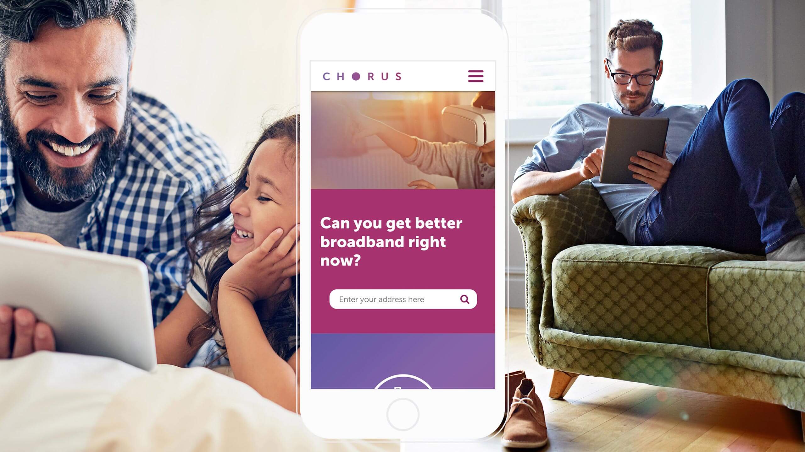
Chorus website
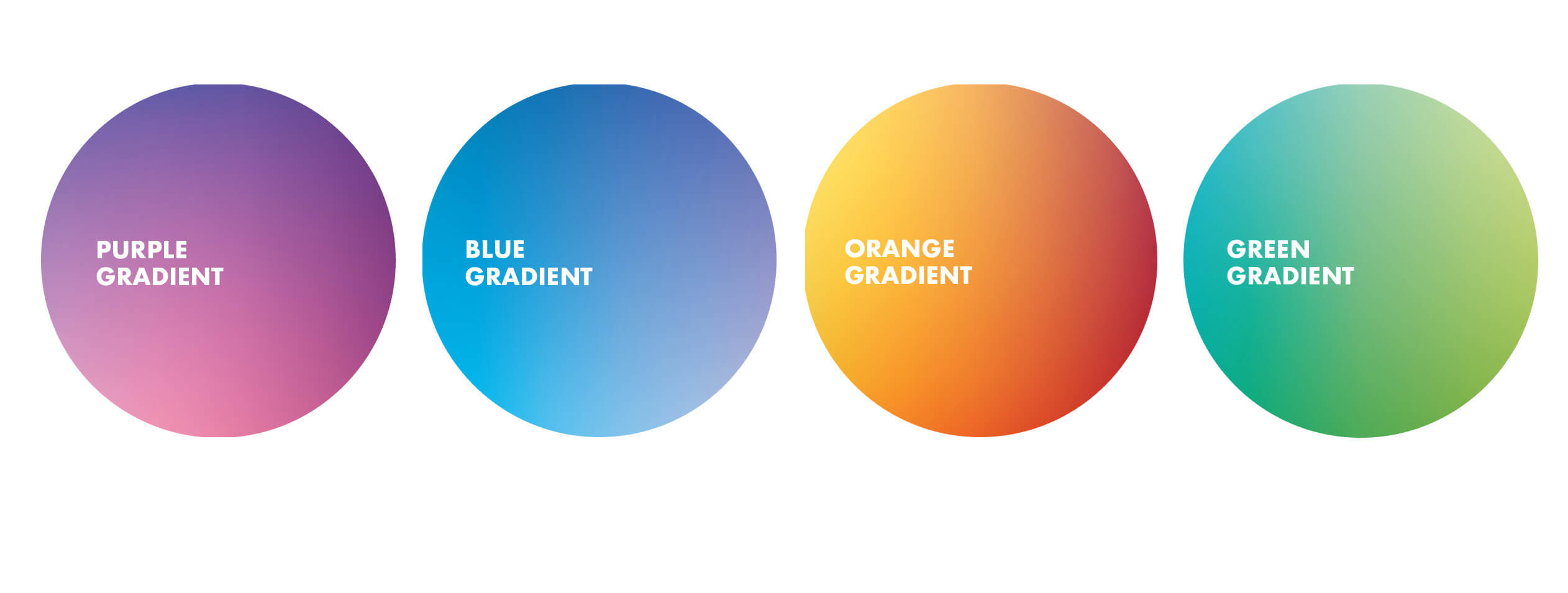
The new Chorus branding is about renewal, opportunity, possibility and working together. They're the portal that connects New Zealand to everything and can take them anywhere.
My approach to the new Chorus website redesign was to incorporate the new branding look and feel and create a site that is user-friendly. Navigation to customers fibre status and information about Chorus and their role was a primary goal.
I did this by simplifying the page layout and visualising key pieces of information into iconography. I also incorporated the brand 'portal' as a way to house imagery.
Overall the website is more accessible to digest technical information and allow users to understand the role Chorus has and how it benefits them.
Role Senior Art Director
Year 2018
Agency Saatchi & Saatchi NZ
Client Chorus
Role Senior Art Director
Year 2018
Agency Saatchi NZ
Client Chorus
Role Senior Art Director
Year 2018
Agency Saatchi NZ
Client Chorus
Role Senior Art Director
Year 2018
Agency Saatchi NZ
Client Chorus
Role Senior Art Director
Year 2018
Agency Saatchi NZ
Client Chorus
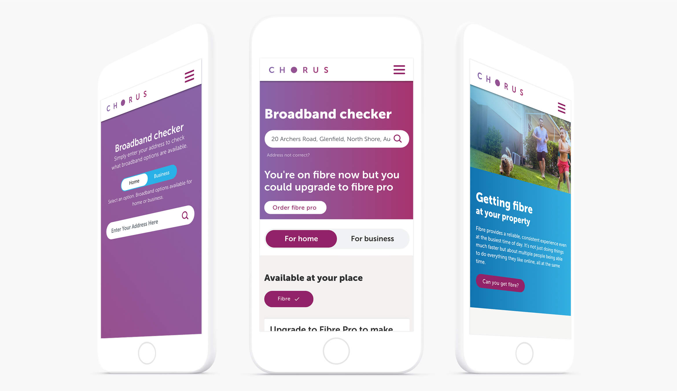
Responsive
The website is responsive so users can quickly check their fibre status within a mobile first approach.
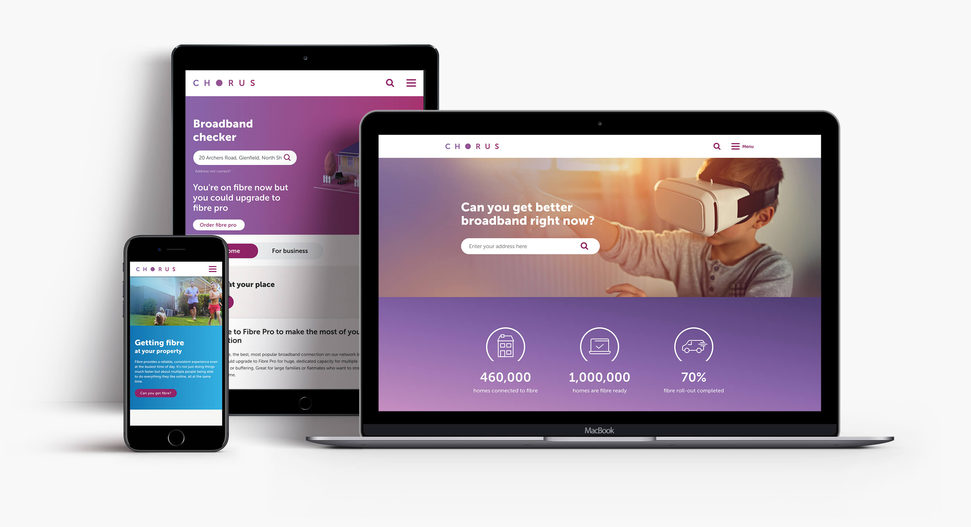
The portal
The logo’s focal point is the letter ‘O’, which represents a window into the opportunities, Chorus brings to New Zealand, a portal to unlimited possibility. The portal is used as a visual device throughout the website to house photography.
The portal
The logo’s focal point is the letter ‘O’, which represents a window into the opportunities, Chorus brings to New Zealand, a portal to unlimited possibility. The portal is used as a visual device throughout the website to house photography.

Iconography
Iconography was used to help deliver key benefits that Chorus was carrying out for New Zealand.
Iconography
Hey there, this is the default text for a new paragraph. Feel free to edit this paragraph by clicking on the yellow edit icon. After you are done just click on the yellow checkmark button on the top right. Have Fun!
Iconography
Iconography was used to help deliver key benefits that Chorus was carrying out for New Zealand.
Illustration
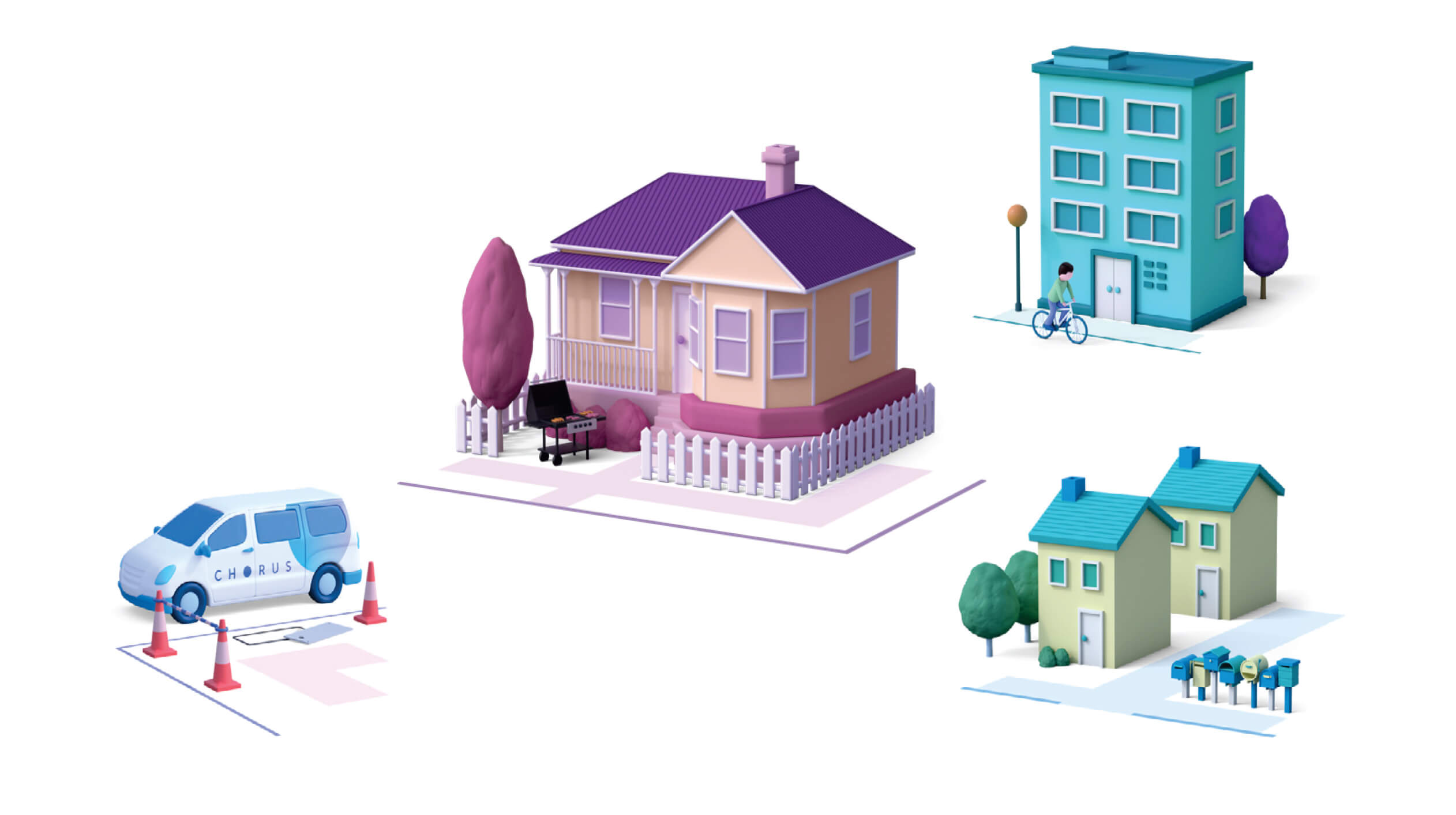
A simple 3D render illustration was introduced to visualise different types of New Zealand buildings and Chorus utilities.
Hero illustrations
Hey there, this is the default text for a new paragraph. Feel free to edit this paragraph by clicking on the yellow edit icon. After you are done just click on the yellow checkmark button on the top right. Have Fun!
Colour palette

Other work
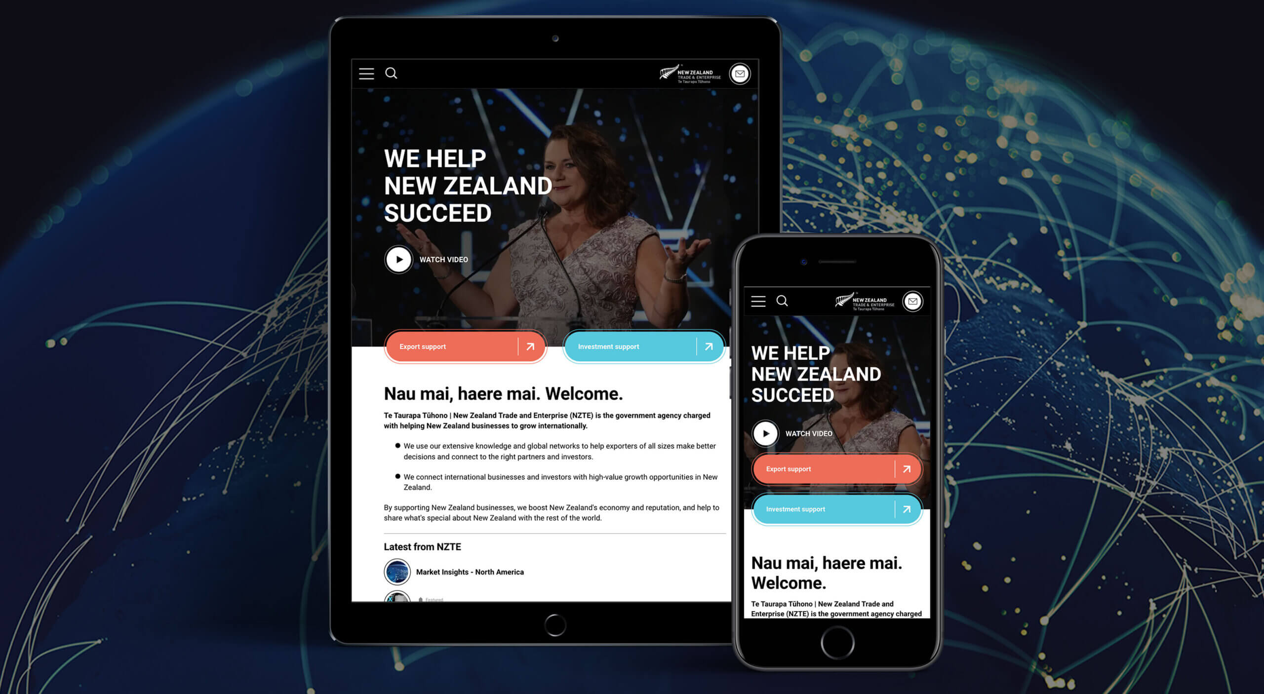
NZTE - Website redesignResponsive website
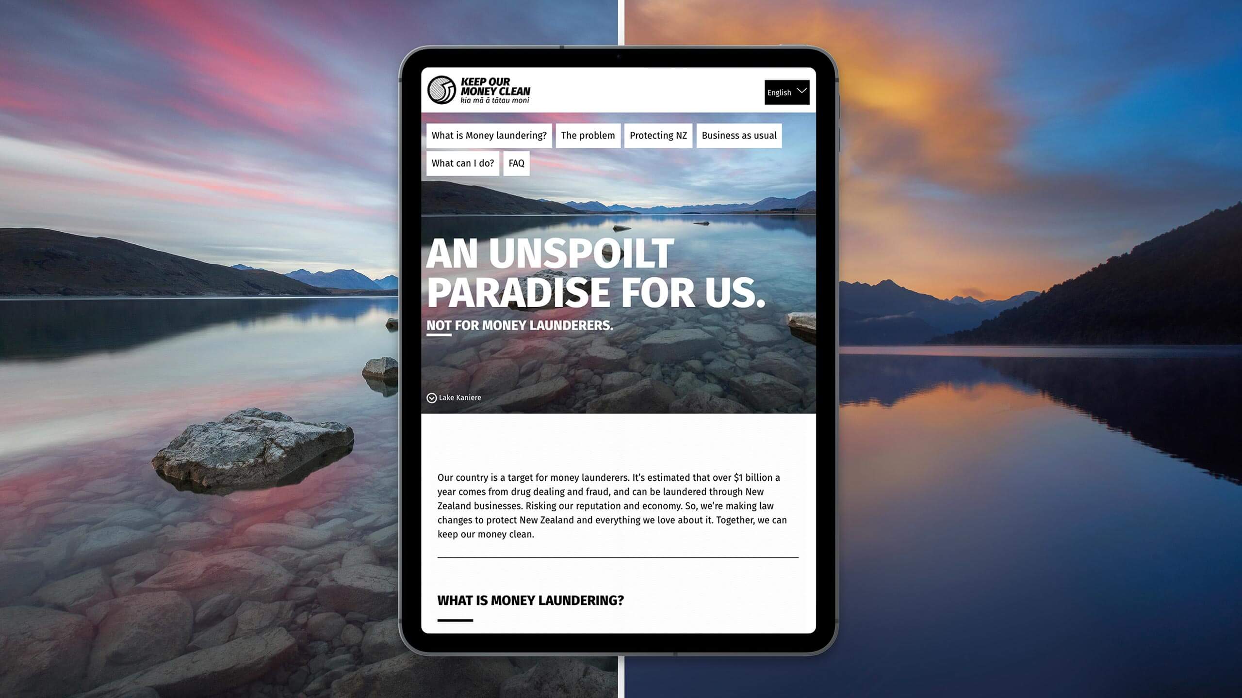
Keep our money clean - Website and CollateralMinistry of Justice
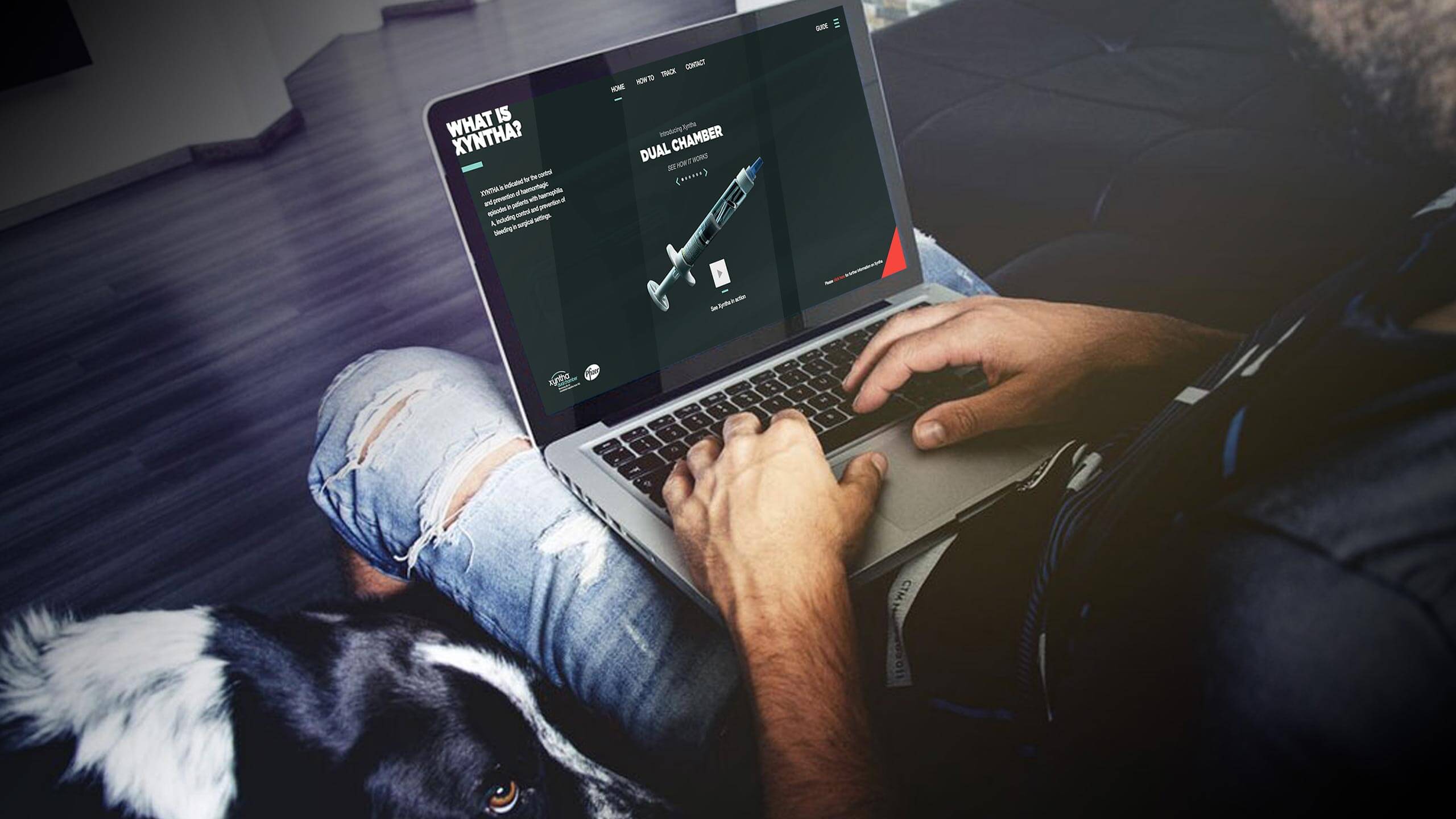
Pfizer - Xyntha - Website and product designWebsite and collateral
CareMate - App designLogo design

Okana - Social CampaignCampaign
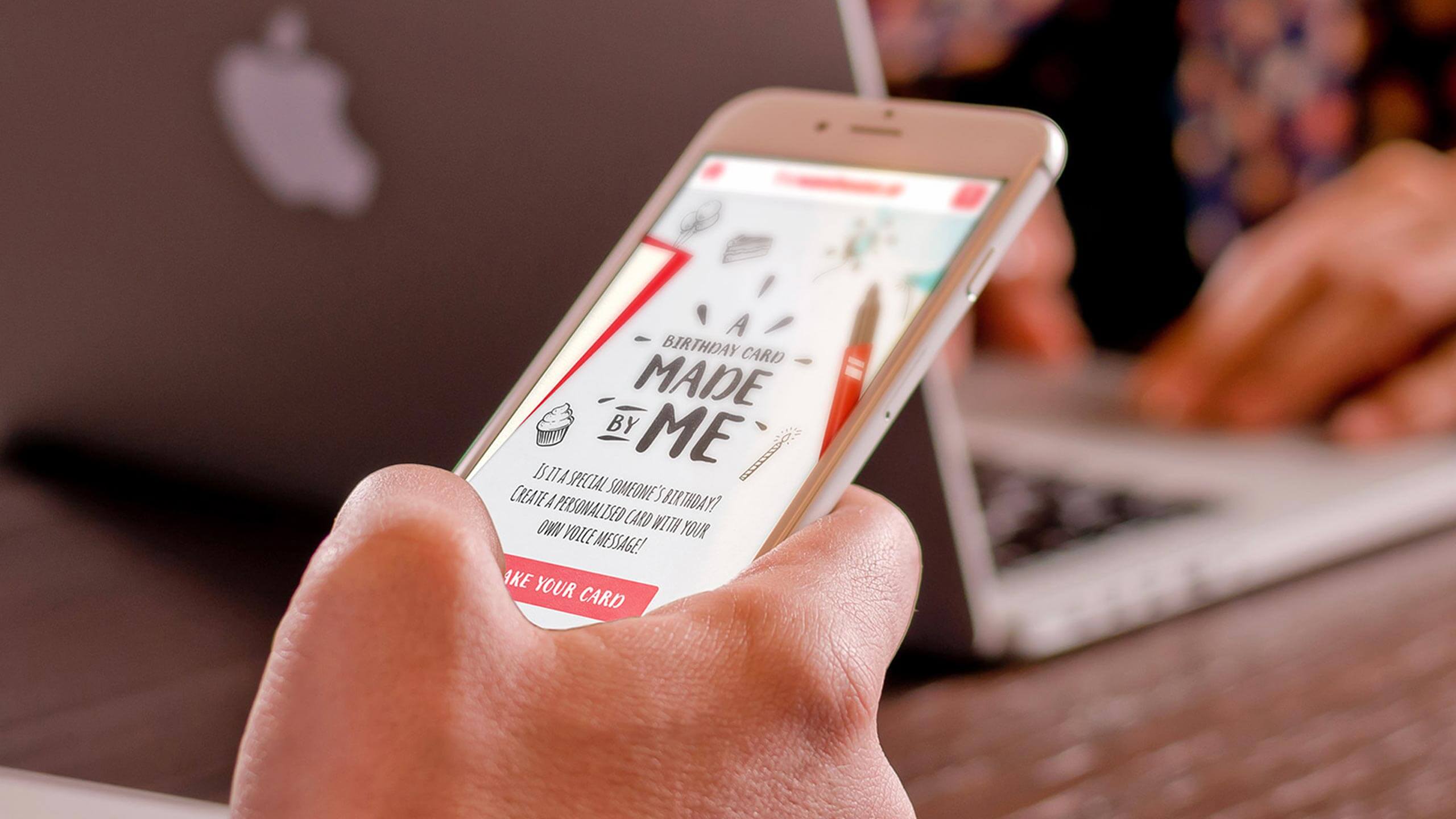
Made by me - App designWebsite Design

#BRINGDOWNTHEKING - Website designIntegrated
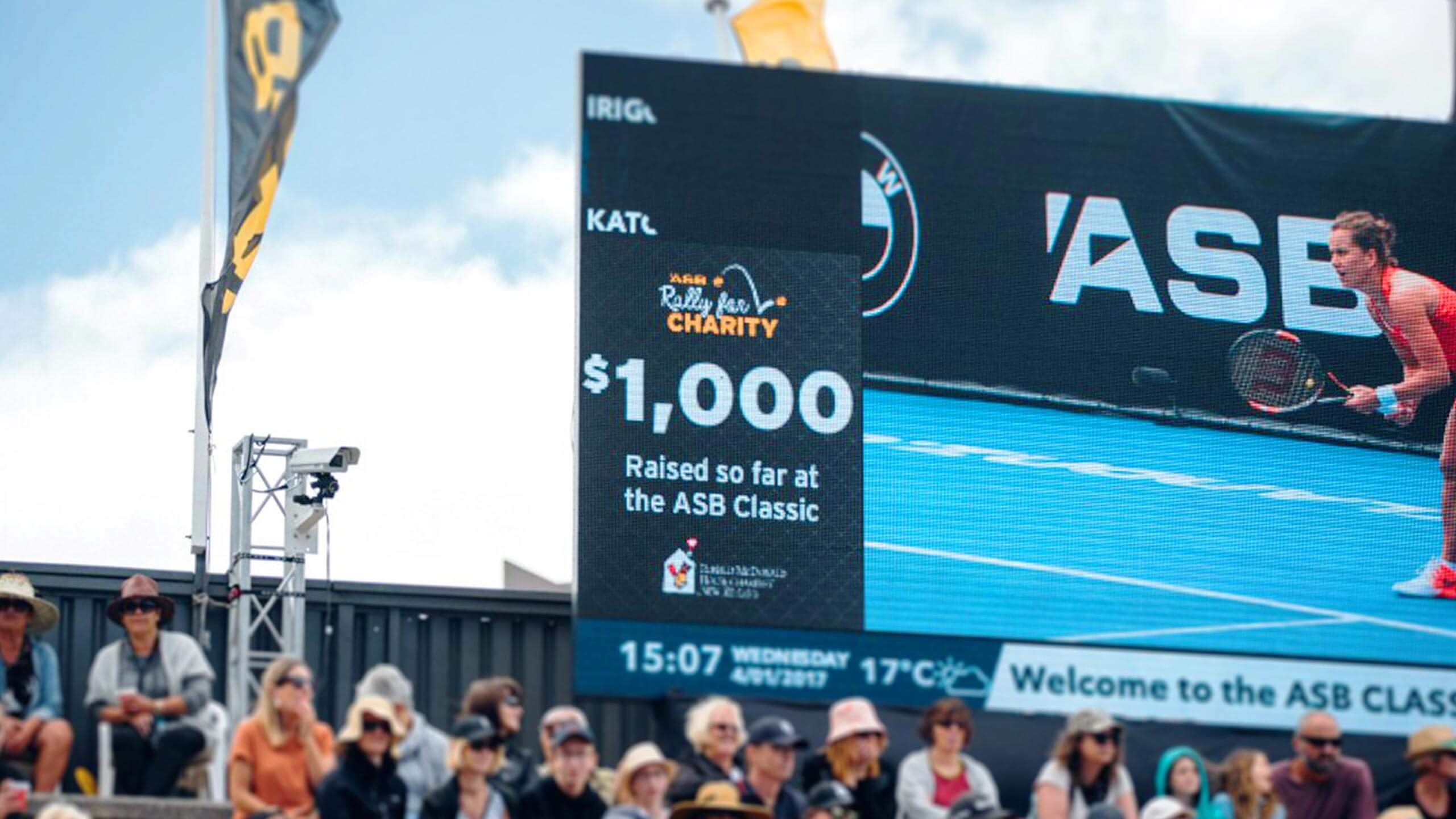
Rally for Charity - Digital activationActivation
The M word - CampaignCampaign
BMW - zzz series - viral videoApril fools

ASB Ranqx - Online VideoOnline
Sam Schrey, Auckland, New Zealand. email [email protected]
