Pfizer - Xyntha
Pfizer had won the Haemophilia tender with Pharmac to transition 200 new patients onto Xyntha (36 patients were currently using Xyntha). We were tasked with creating a confident transition for these patients who deal with a life-threatening diagnosis every day, making their transition as easy and painless as possible.
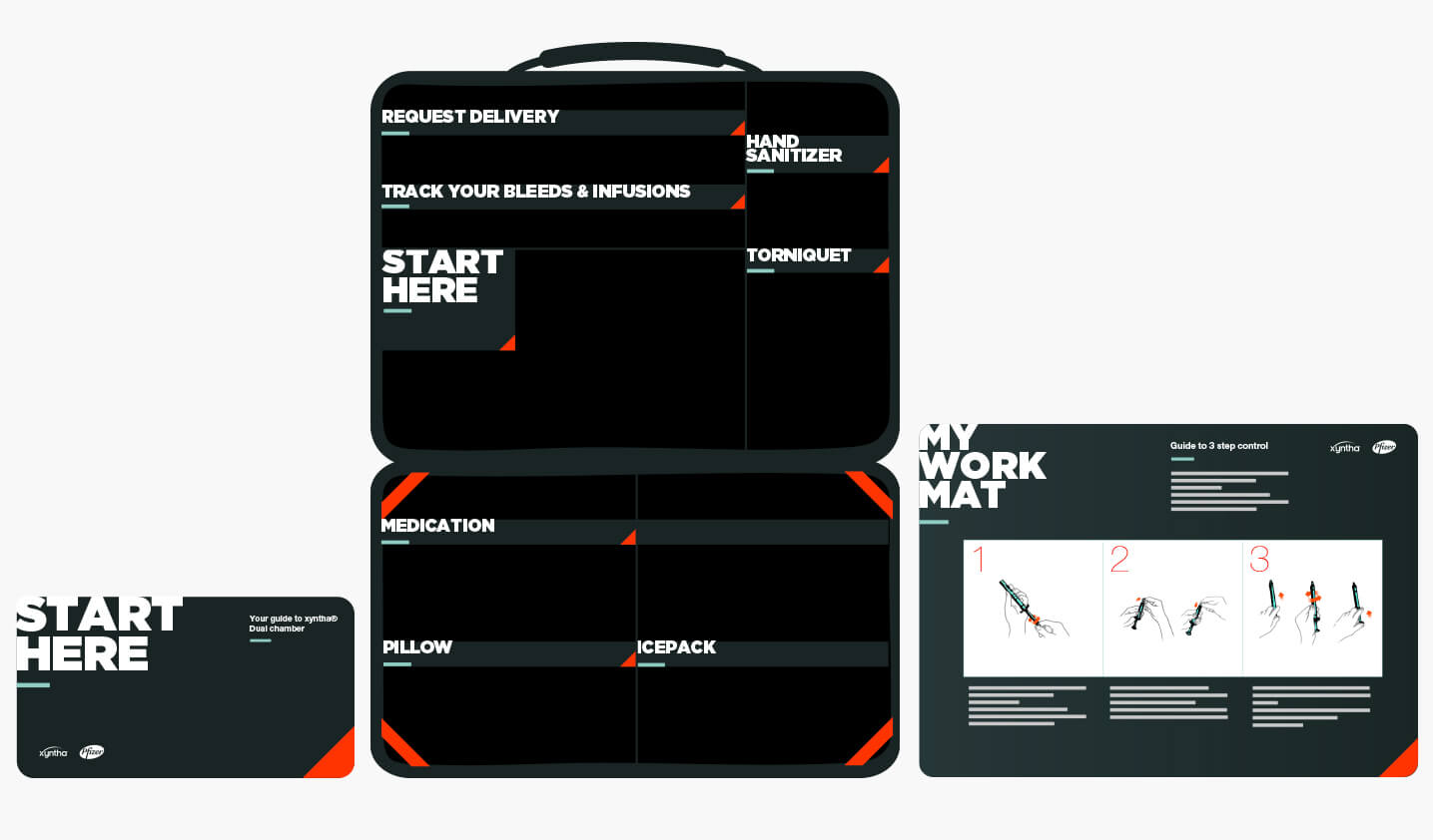
We approached this task by creating a cohesive look and feel for the physical toolkit, digital assets and collateral by housing the information in a clear, easy and reassuring way that also helped doctors transition their patients.
Role Art Direction, Creative
Year 2016
Agency DDB
Client Pfizer
The design
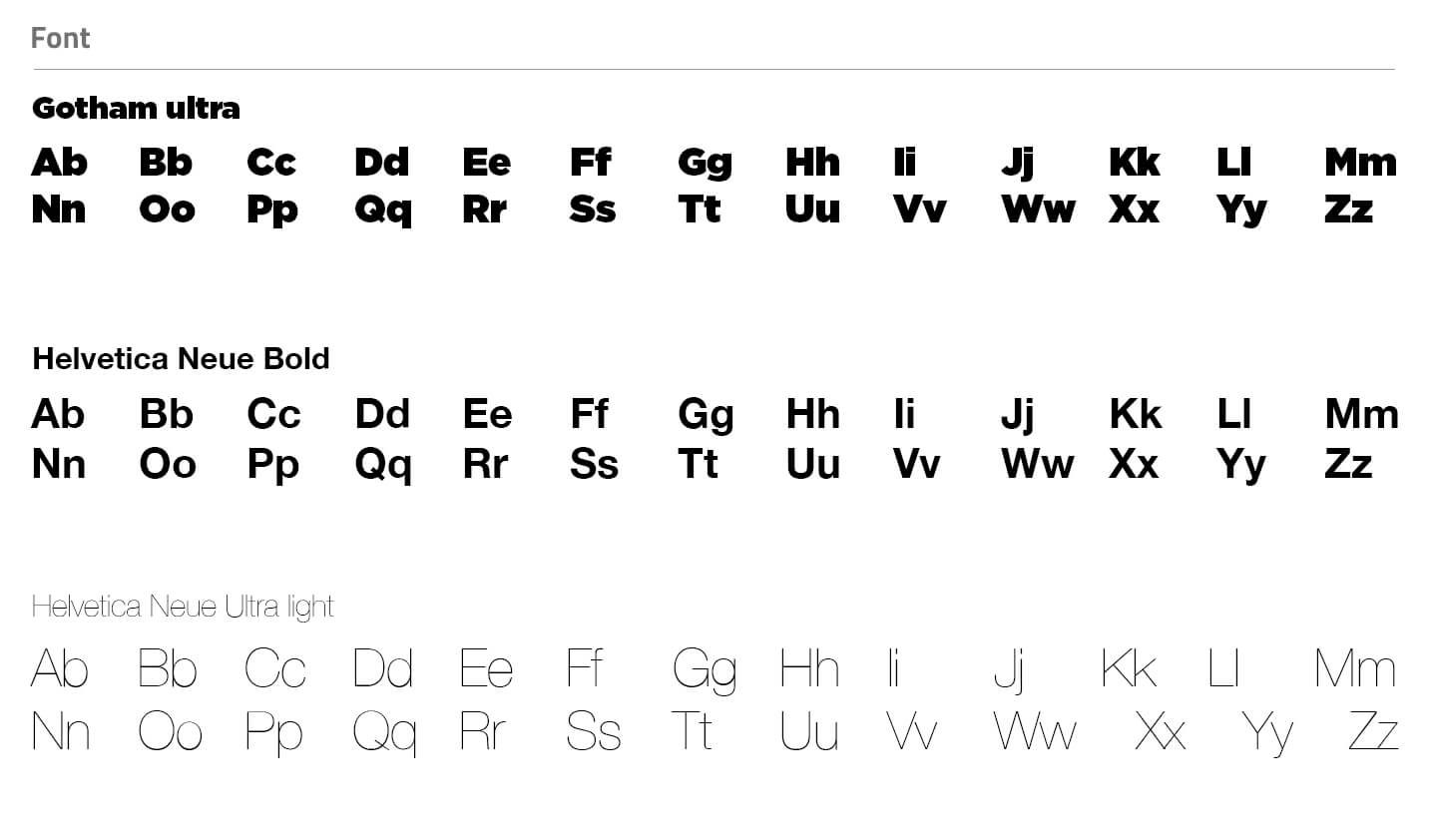
Hemophilia is a disorder in which blood doesn't clot normally and predominantly affects males. Our design approach was a male skew with bold typography and feature colours like teal and red. I wanted the design not to feel typically medical but fresh, modern and professional, so information was easily understood and trustworthy.
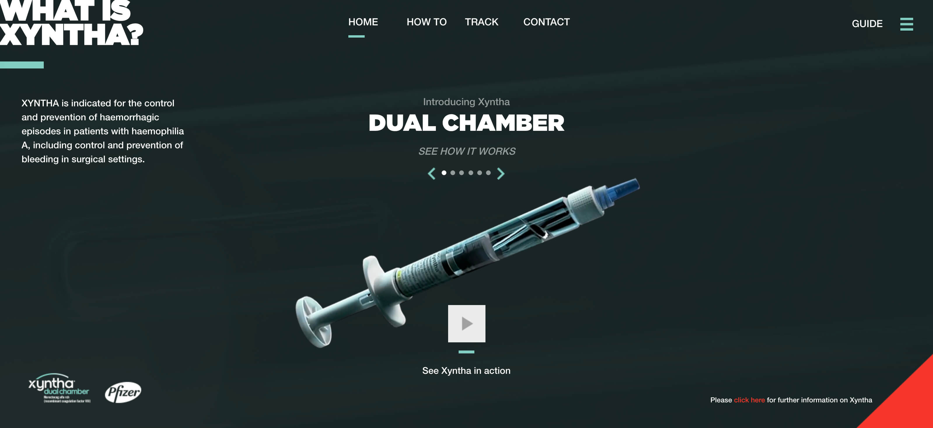
The Website
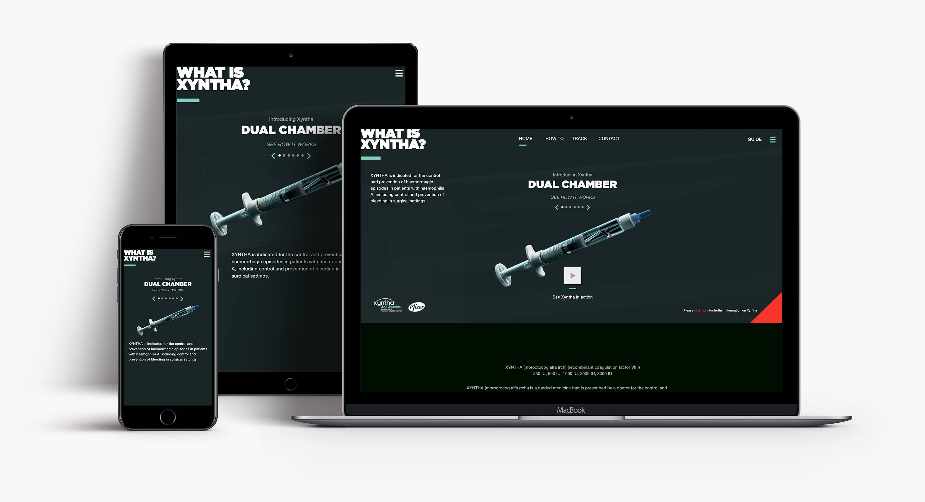
We created a responsive website that carried the look and feel from the toolkit and collateral into a digital space. We had existing video assets from the USA that we put a New Zealand voice over the top, and we also created a how-to video showing how the Xyntha product worked so patients could see how easy the new transition was. PDF guides were recreated and downloadable for patients.
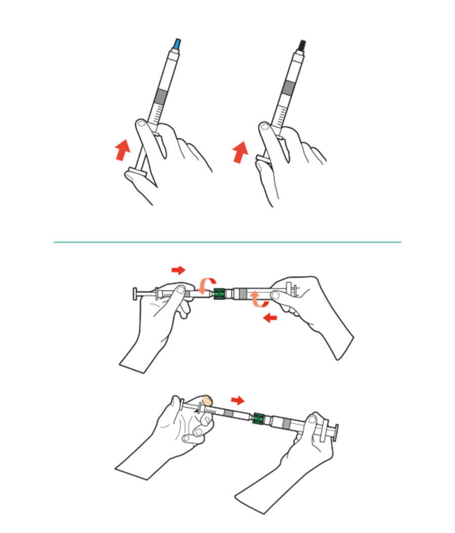
Illustrations
All technical drawings of how to use the product were redrawn in the new look and feel to be easy to understand, more contemporary and less medical.
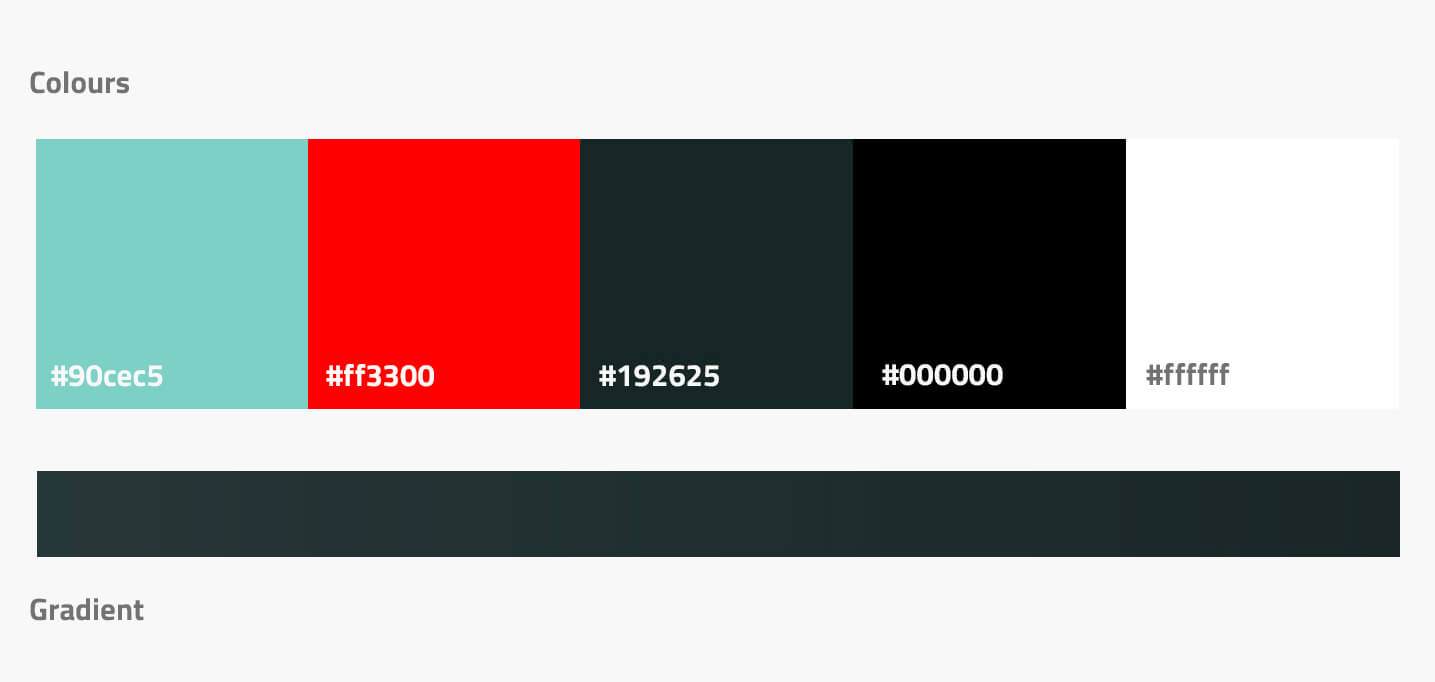
Colours
My colour approach considerations were masculine, bold and trustworthy.
Colours like red and teal were used as a feature to highlight essential information. Dark forest green and black were used as base colours to house the overall look.
The toolkit
The toolkit is on a patient at all times, so the approach was to be small, organised, easy to use and inconspicuous so patients could carry the toolkit without unwarranted attention. I designed the layout inside the pack and figured out how all the following would fit into the case.
- The toolkit contained
- A Xyntha guide/instruction booklet
- Laminated placemat
- Medication
- Sharps disposal container
- Mini cushion
- Tourniquet
- Hand sanitizer
- Icepack
- Booklet for Tracker Factory
- Pfizer direct delivery booklet
Other work
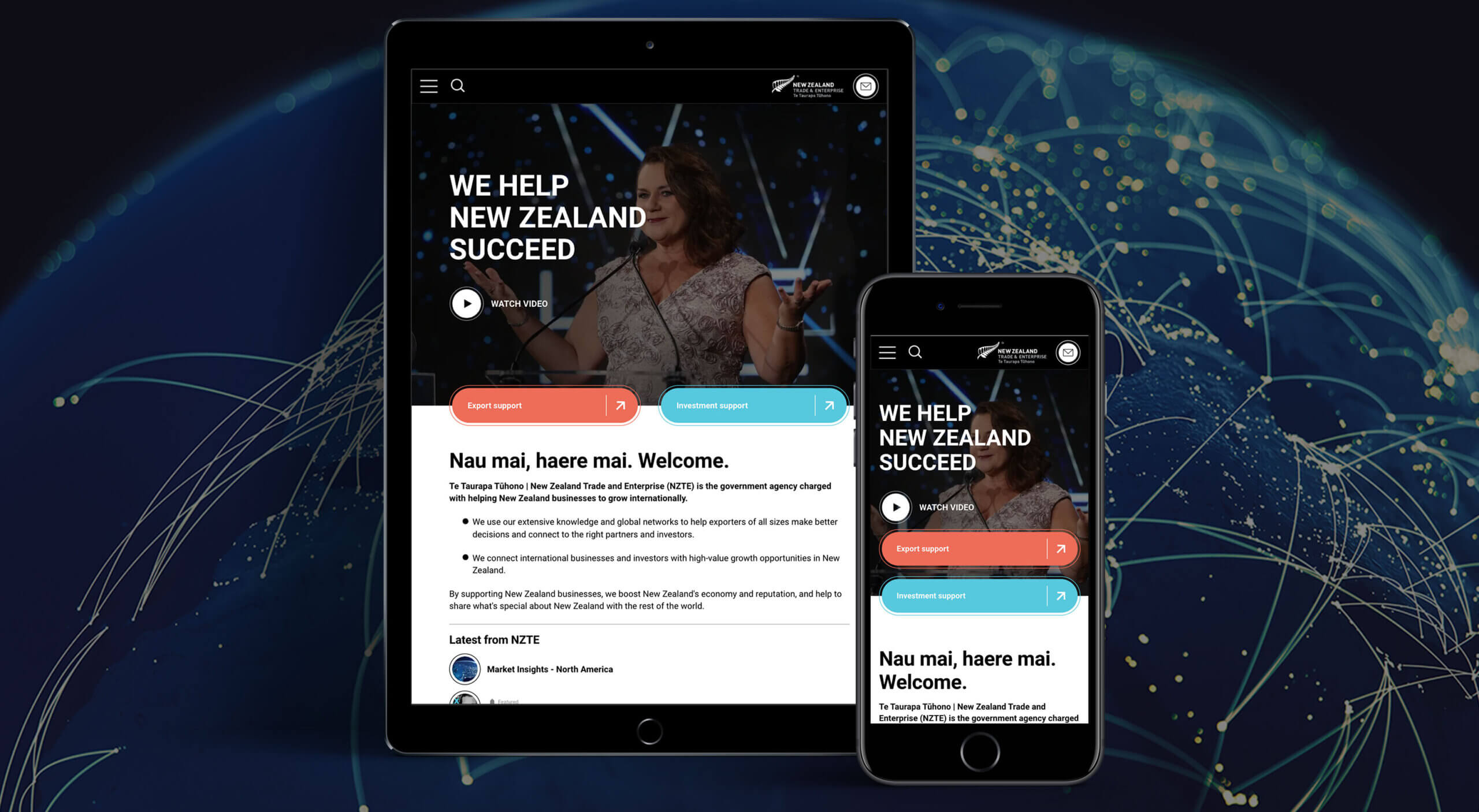
NZTE - Website redesignResponsive website

Chorus - Website redesignWebsite Design
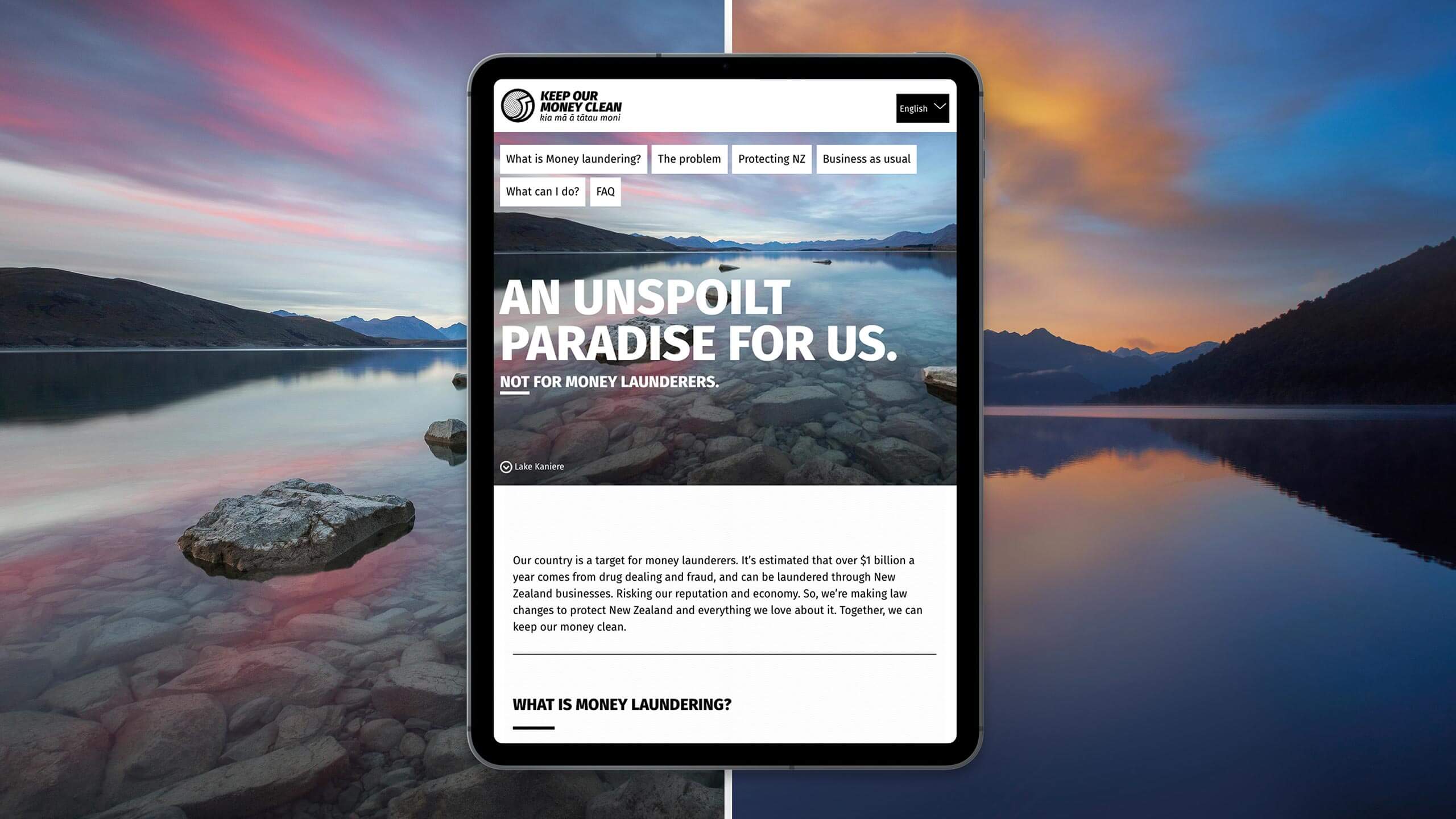
Keep our money clean - Website and CollateralMinistry of Justice
CareMate - App designLogo design

Okana - Social CampaignCampaign
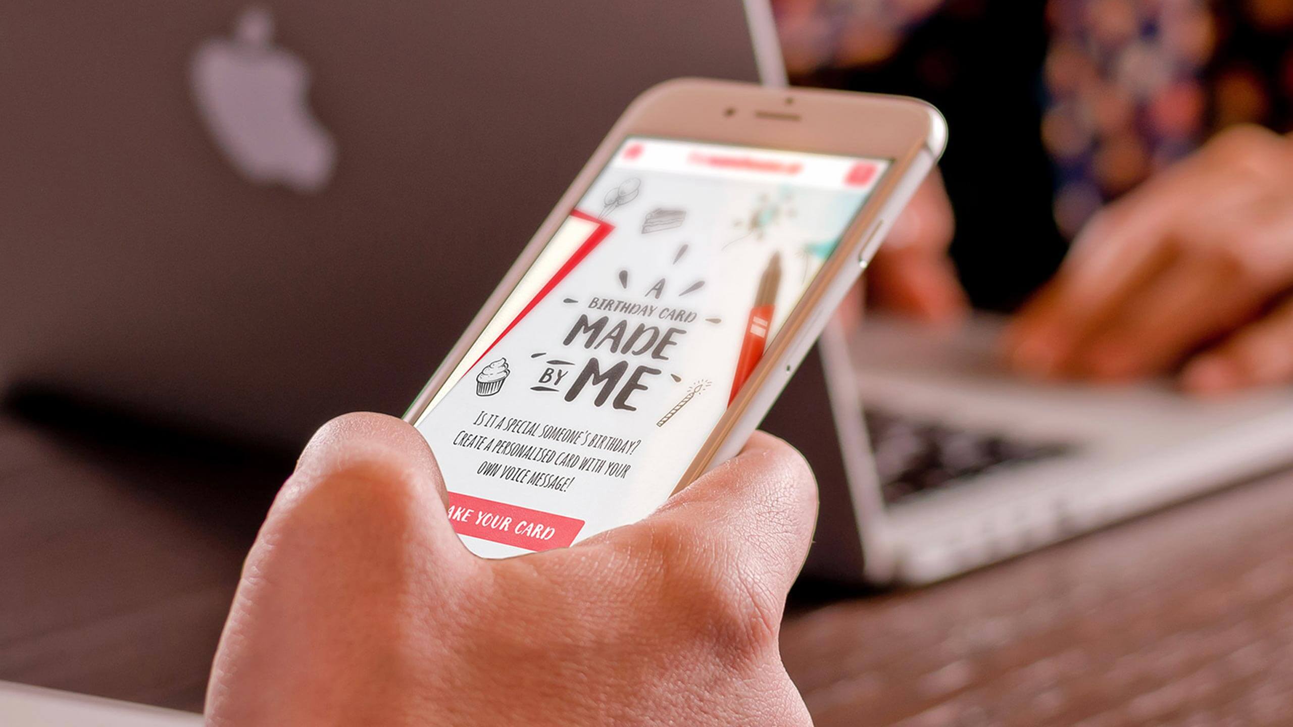
Made by me - App designWebsite Design

#BRINGDOWNTHEKING - Website designIntegrated
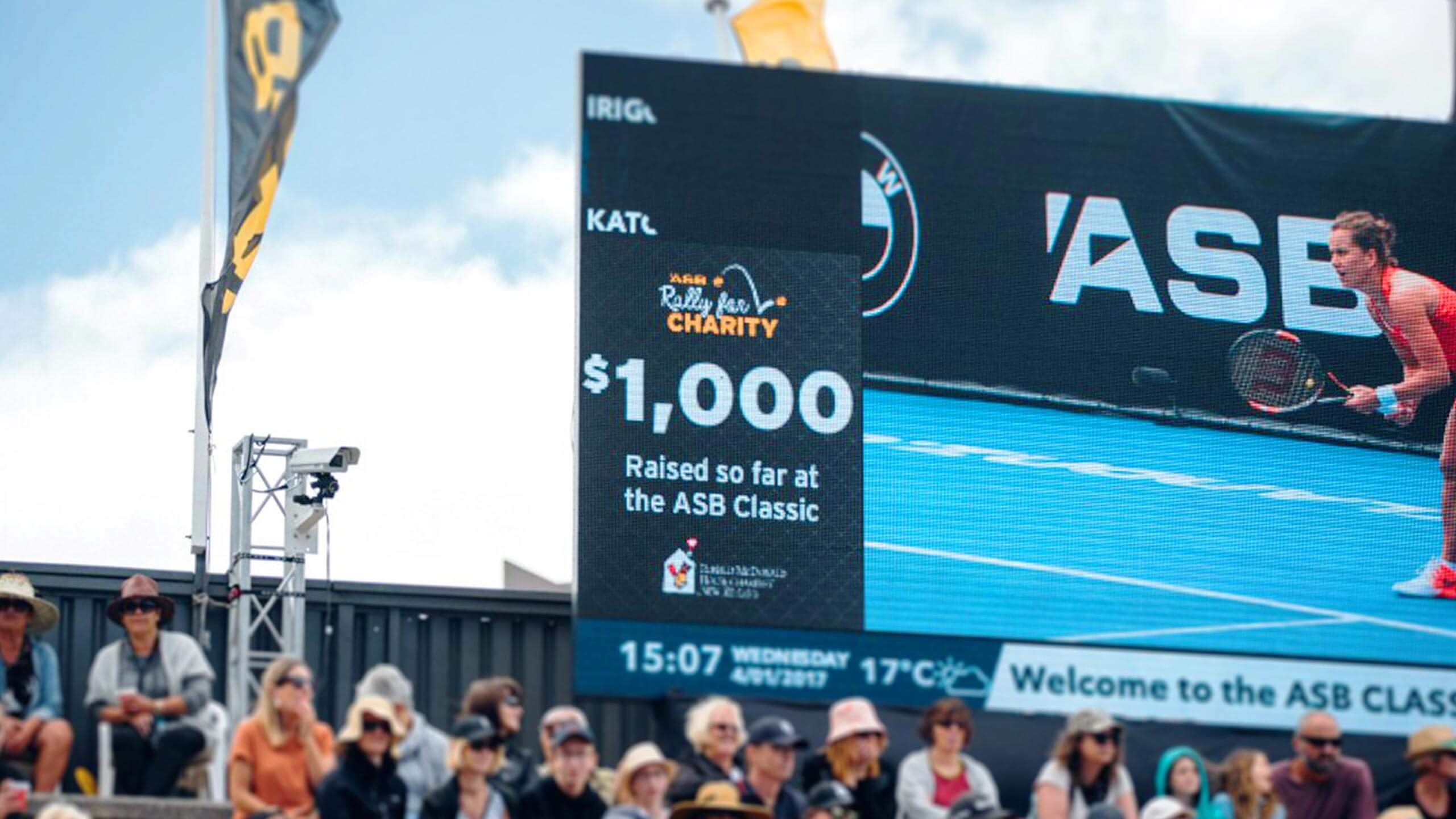
Rally for Charity - Digital activationActivation

The M word - CampaignCampaign
BMW - zzz series - viral videoApril fools

ASB Ranqx - Online VideoOnline
Sam Schrey, Auckland, New Zealand. email [email protected]
